A concierge care team, in every member's
pocket
Hoag Compass turns a $99/month longevity membership into a daily product: care plan, 100+ biomarker results, and direct messaging with the clinical team.
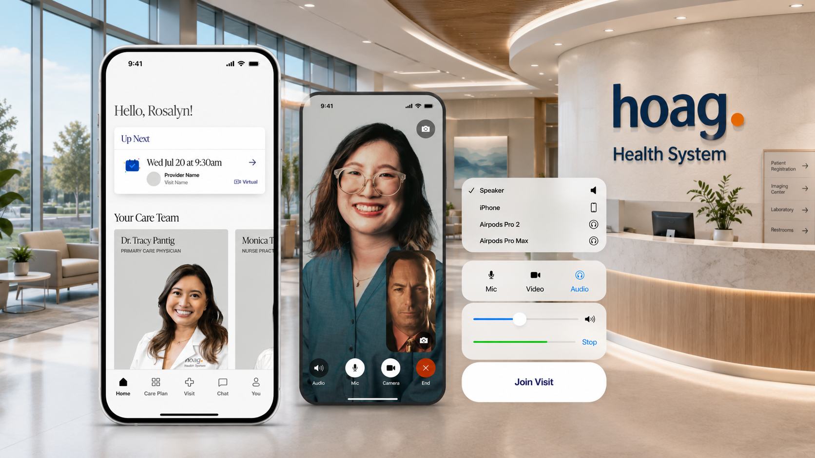
The membership lives in the app?
Hoag Compass is a membership concierge primary and preventative care program from Hoag Memorial Hospital Presbyterian, layered on top of insurance and built around proactive longevity care rather than sick visits. The app is where that promise gets delivered: it carries the member's personalized care plan, their health journey stages, advanced lab and genetic results, and the messaging channel to the people providing care.
That makes it a clinical surface, not a wellness app. Every screen holds protected health information, results members will read before a clinician explains them, and conversations that need to arrive reliably on both iOS and Android.
- Personalized care plan and health journey as the product spine
- Advanced lab panels covering 100+ biomarkers, plus genetic testing
- Direct messaging with a care coordinator and medical assistant
- Virtual and in-person appointment booking, in-app
- Shipped on the App Store and Google Play (org.hoag.compass)
Continuous care is hard to deliver through a screen
Concierge care is defined by access and attention. Translating that into software means handling sensitive data carefully, making dense clinical results legible, and keeping a high-touch relationship alive between visits.
Sensitive data on a consumer device
The app carries PHI, lab results and genetic testing outcomes. Data handling had to support encryption in transit and user-initiated deletion, with a Play Store data-safety declaration that matches reality.
100+ biomarkers, one clear story
Advanced panels and genetic results are overwhelming raw. They had to be analyzed into a single custom care plan a member can actually act on.
A care team, not a chatbot
Members message real coordinators, medical assistants, coaches and clinicians. Delivery, threading and context had to be dependable enough for clinical communication.
Momentum between appointments
Preventative care only works if members keep going. The product needed structure that turns a long-term plan into things you can finish this quarter.
Insurance and ID capture
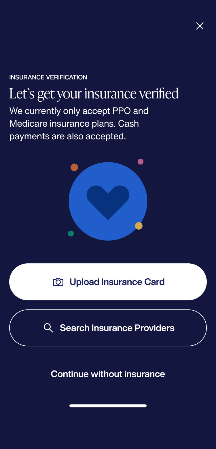
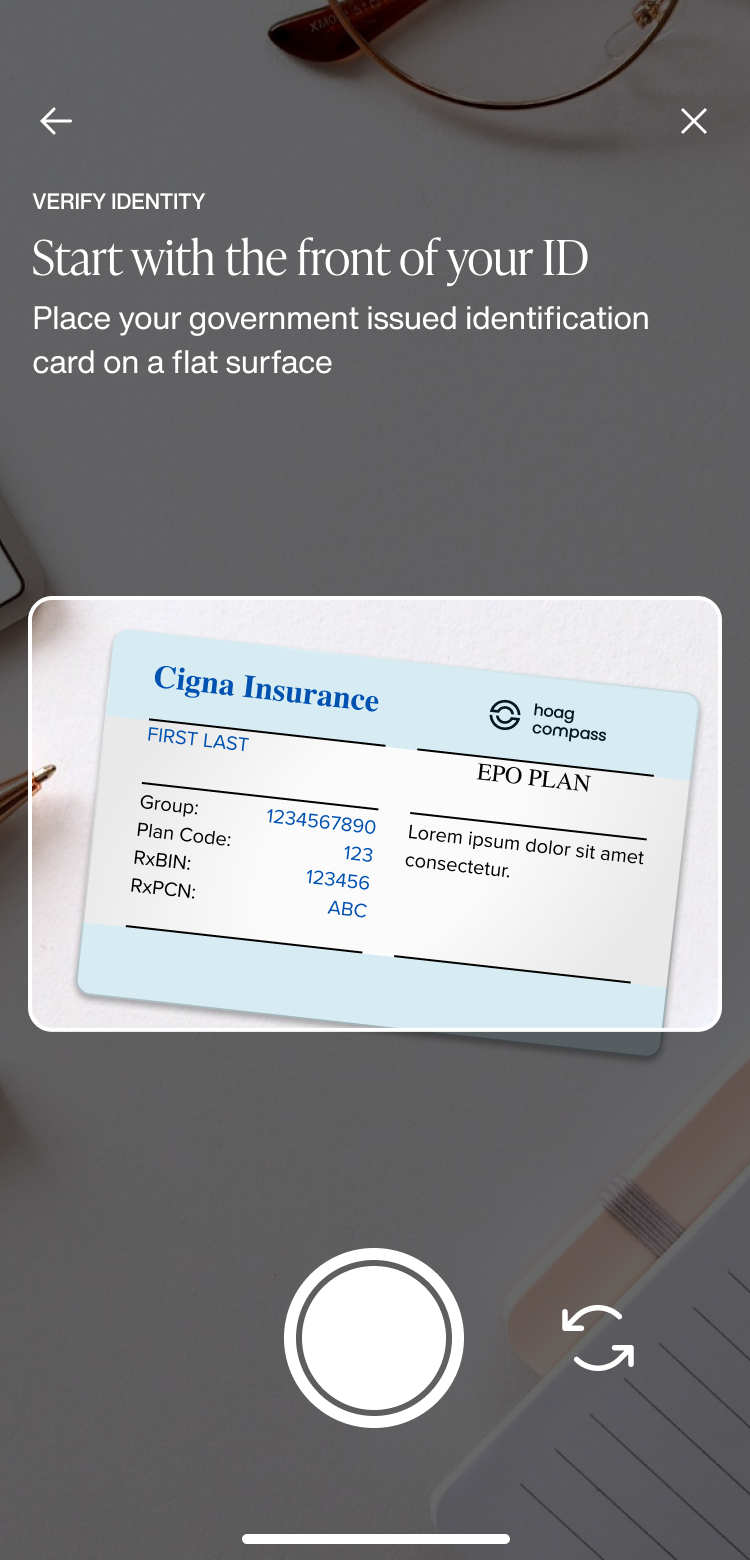
Members upload an insurance card, search accepted providers, or continue without insurance, then capture their ID with a guided camera step.
Visit booking
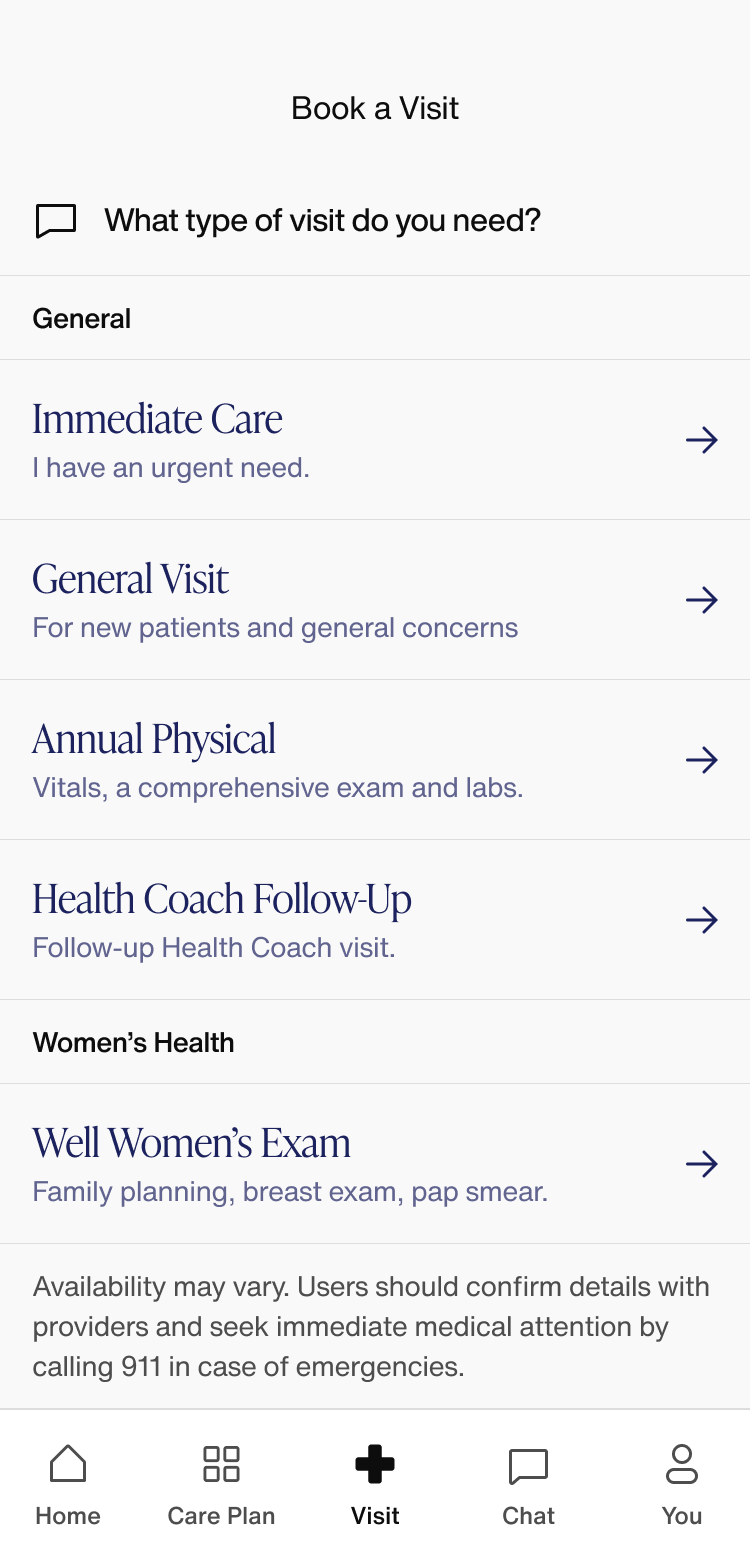
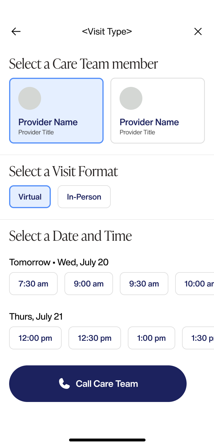
Members choose a visit type across general and women's health categories, then pick a care team member, virtual or in-person format, and an available date and time.
Home and lab prep
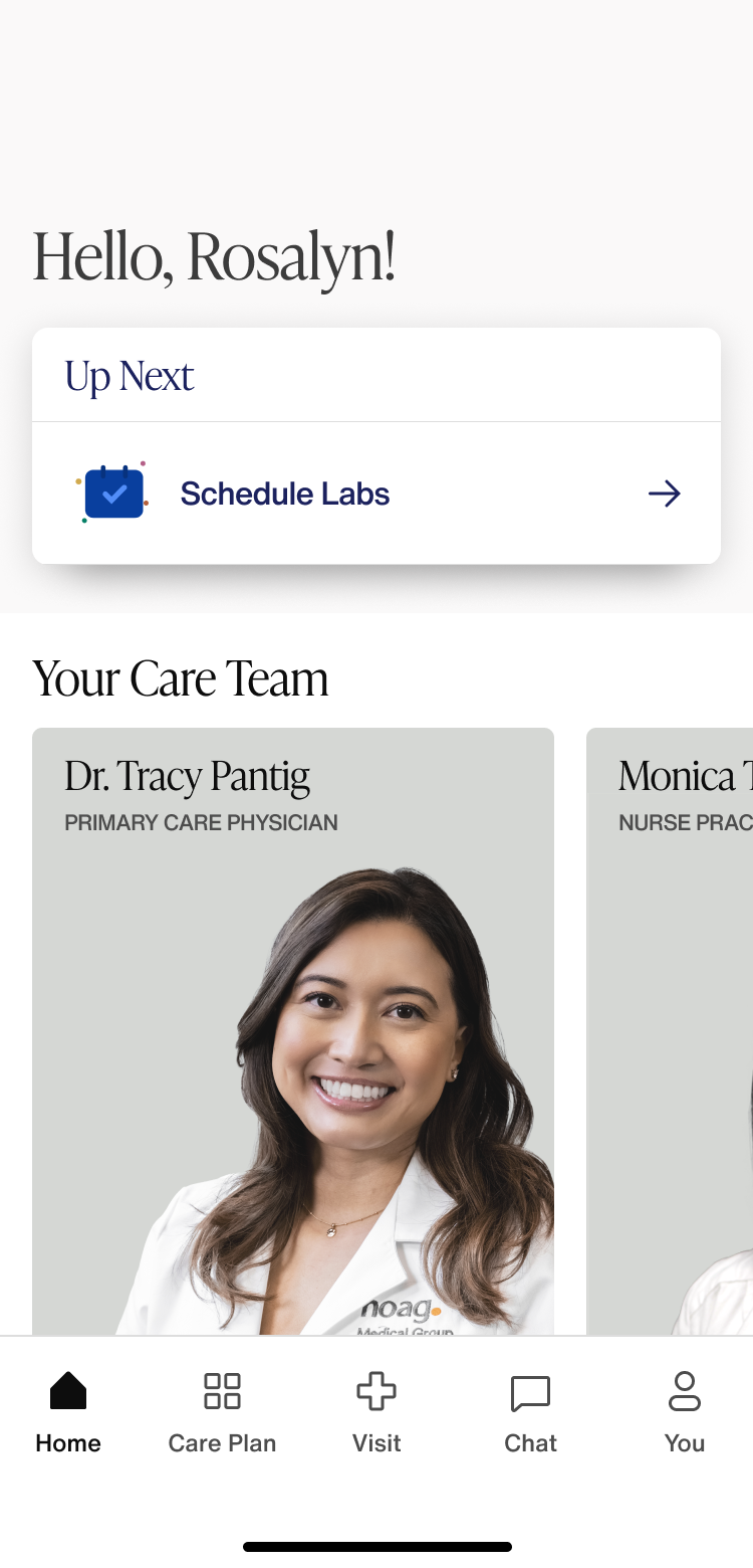
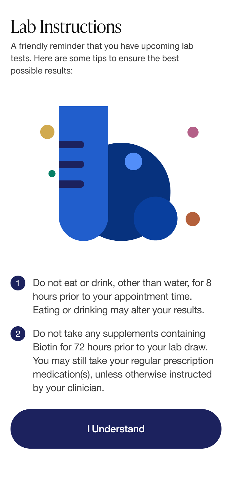
The home screen greets members with an Up Next action and their named care team, then walks through pre-lab fasting instructions before confirmation.
Coaching & mental health access
Health coach and nutritionist guidance on nutrition and exercise, plus access to an on-site clinical psychologist and mental health support.
90-day improvement cycles
Task-based cycles break the long-term plan into completable steps that move members through their journey stages.
Booking & add-on services
Virtual and in-person appointment scheduling, with in-app purchases for add-ons like advanced labs and DNA testing.
Build for clinical trust first.
A membership product that holds genetic results earns attention differently than a consumer app. We designed around legibility, restraint and native platform behaviour.
We anchored navigation to the care plan and journey stages rather than a feed. Members open the app with a question — what should I do next — and the first screen answers it.
Biomarker and genetic data is presented in plain language with clinical context, and always tied back to the care plan actions it informs. Depth is available; it isn't the default view.
Care team threads were built with delivery, state and history handled conservatively — no clever ephemeral behaviour, no ambiguity about whether a message reached a human.
iOS and Android were treated as first-class targets with platform-appropriate patterns, and a Play Store data-safety declaration written to match the app's real data behaviour.
Calm, clinical, unmistakably Hoag.
Portrait-first layouts, generous type and a restrained palette keep sensitive results readable under stress — closer to a medical record than a fitness tracker.
Let's ship
the next one.
Tell us about your project. We'll come back within a business day with a scoped plan and a straight answer.