Turning a five-year deposit goal into a daily
habit
Most home-buying apps are calculators with a login?
A first-time buyer opens one, gets a discouraging number, and doesn't come back for six months. The maths was never the hard part — retention on a five-year goal is. Nothing about "three years, two months to go" naturally produces a reason to open an app every morning, and without a daily open there's no data, no engagement and no product.
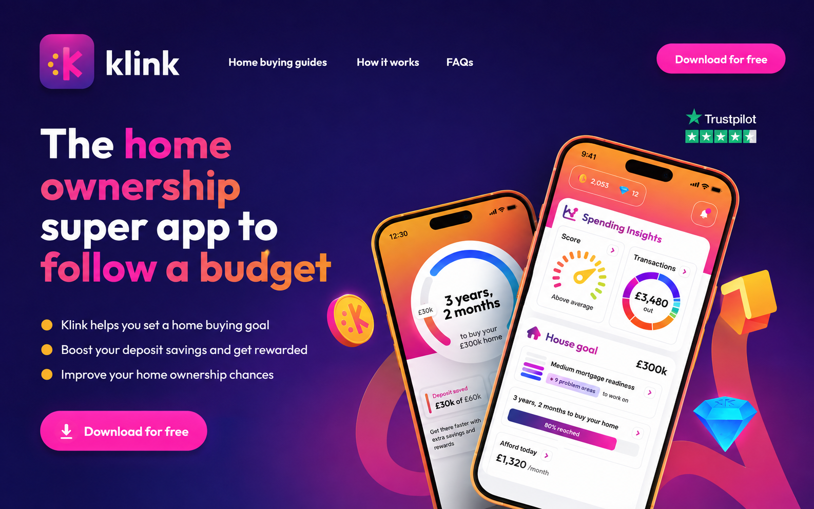
We built Klink for iOS as three interdependent systems: open banking to replace self-reported guesswork with real transactions, an insight layer that scores spending proportionally to each user's own outgoings, and a coin/diamond reward economy that pays people to show up. Each one feeds the next — rewards bring users back, daily visits keep the bank connection alive, fresh data makes the insight accurate, and accurate insight makes the house goal credible enough to keep chasing.
- Two entirely separate home screens: a fully usable pre-open-banking dashboard and a data-rich post-link dashboard
- Proportional scoring so a £1,000/month spender and a £5,000/month spender get the same fair feedback
- Server-driven promotions and banners — growth ships a competition on a Tuesday without App Store review
- Data-trust flows: re-link, re-consent, re-categorise and a statements review surface users can correct
- Diamond supply controlled with explicit reward inventory and per-event yield tagging
A product that had to work before it had any data
Bank linking is the highest-friction moment in the funnel. That single fact shaped almost every decision: the app had to be genuinely worth using before a user handed over their financial life.
A five-year goal has no daily rhythm
Deposit timelines move in months, not minutes. Without an engagement layer on top, there is nothing to return to — and a dormant user is a dead bank connection.
Linking a bank is the biggest drop-off
Treating open banking as a gate meant losing most of the funnel at step one. The pre-link experience had to stand alone as a product, not a locked lobby.
Absolute pound scores punish lower incomes
Judging spend in raw pounds makes the product only useful to high earners. Feedback had to be about behaviour, not salary.
Rotting data destroys the score
Open banking consents expire and categorisation engines guess wrong. A score built on data the user doesn't believe is worse than no score at all.
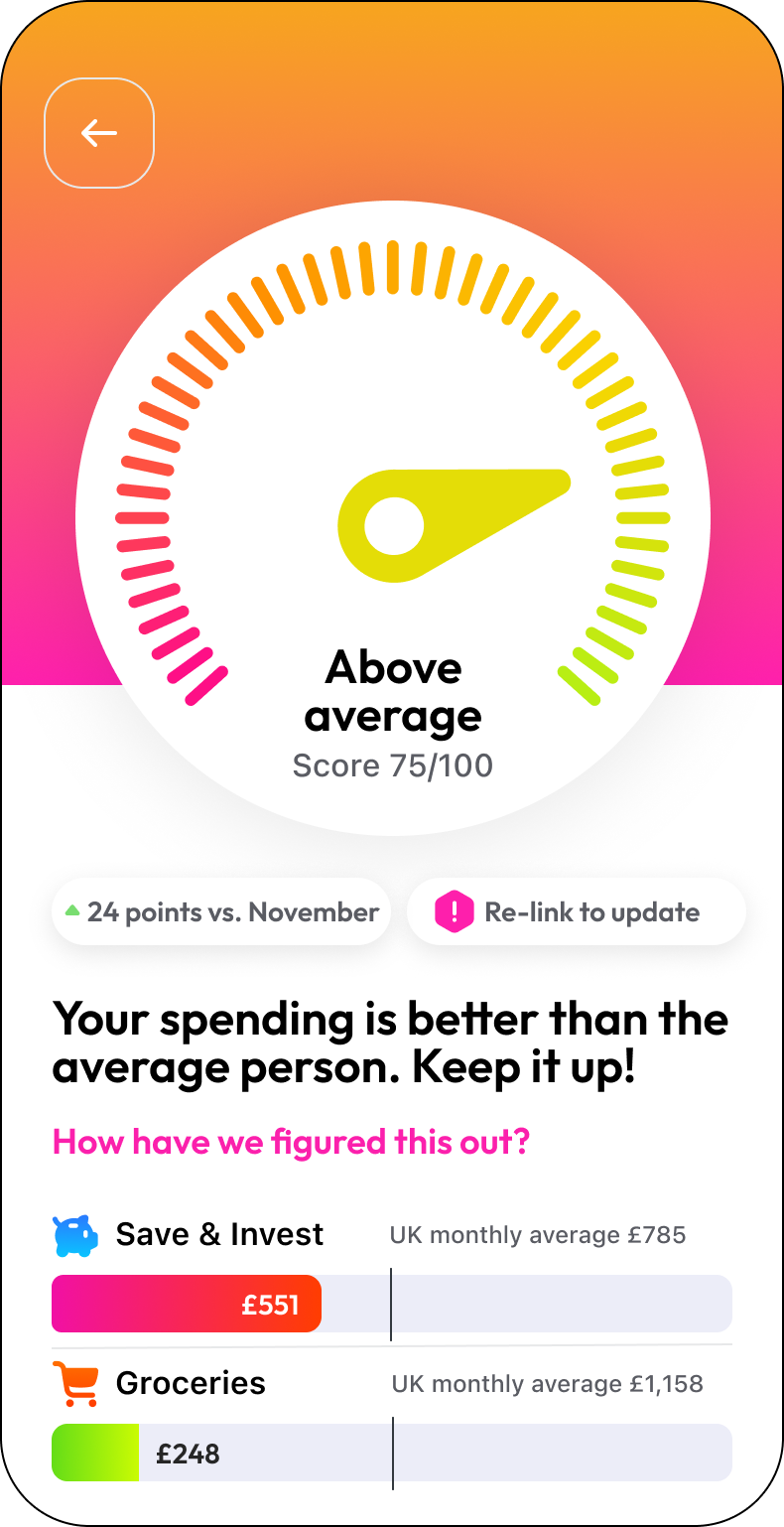
Spendometer & trend insight
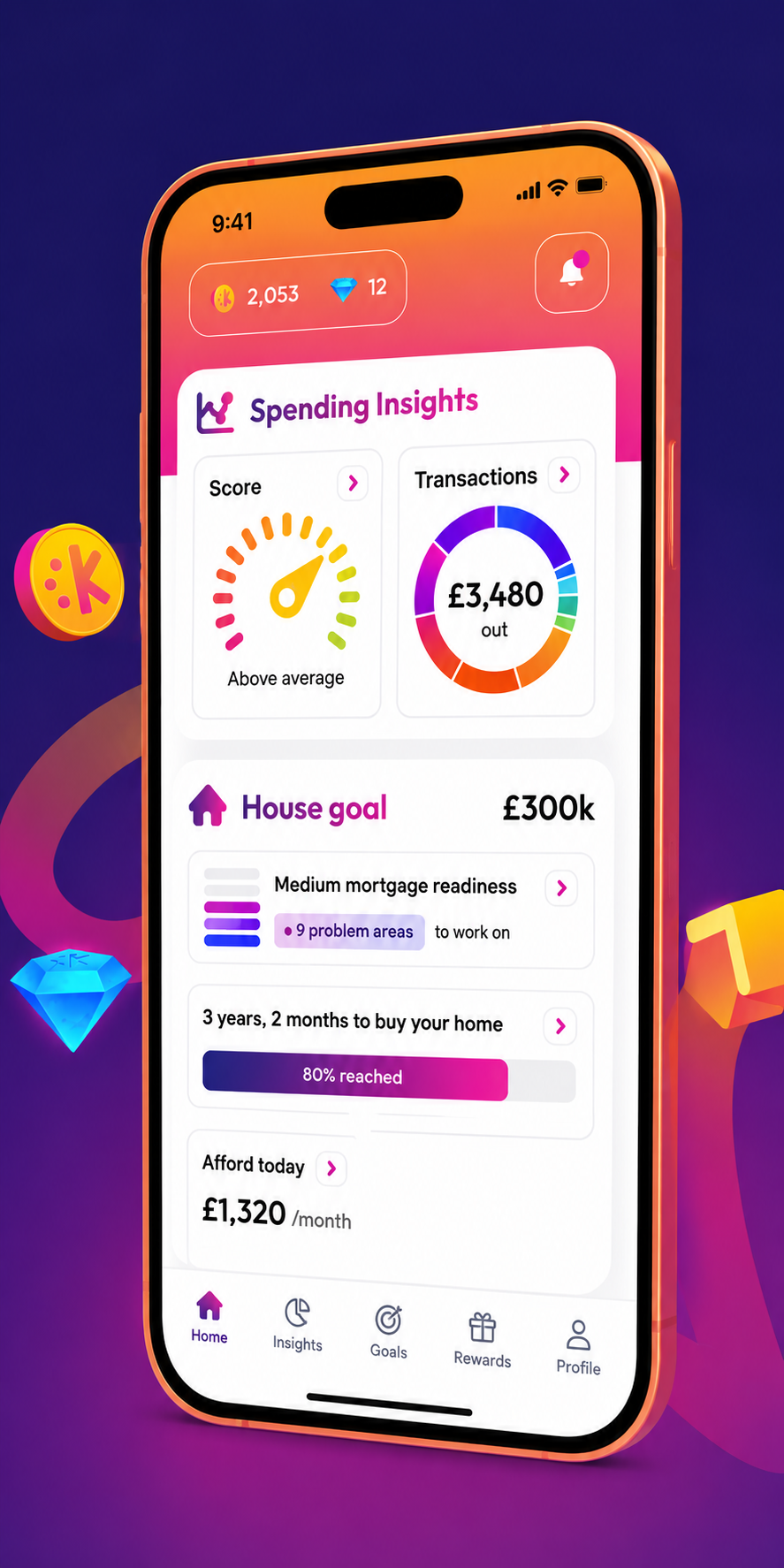
Category breakdowns and month-over-month movement in plain language: "You've spent £300 less than your three month average."
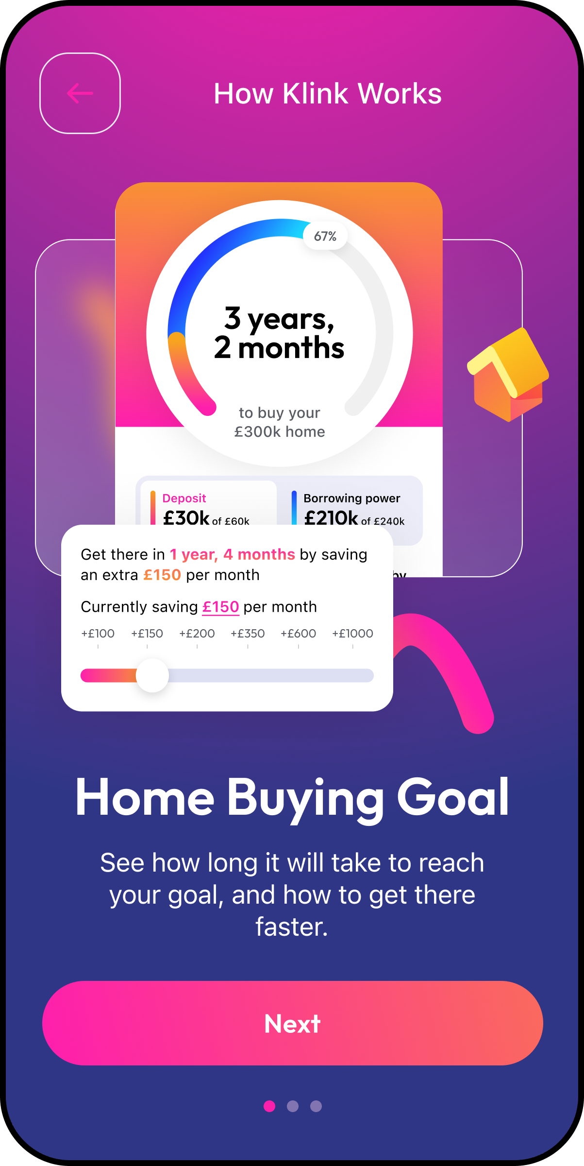
One House Goal, one countdown
Mortgage readiness, borrowing power and deposit progress roll up into a single line: "3 years, 2 months to buy your home. 80% reached."
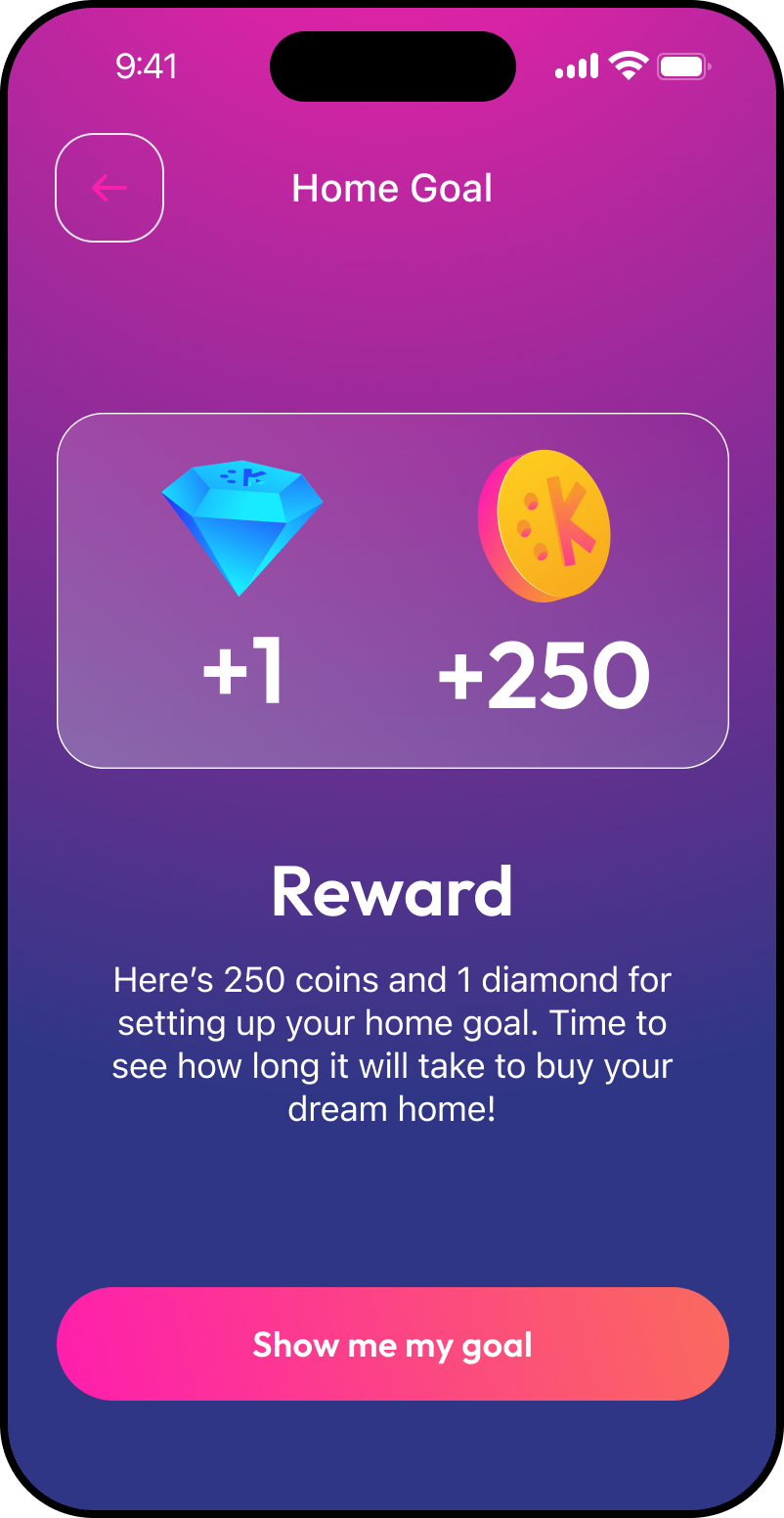
Coins and diamonds
A dual-currency economy with two first-class brand icons at 16/20/24/32/80px, used identically in-app and across every lifecycle channel.
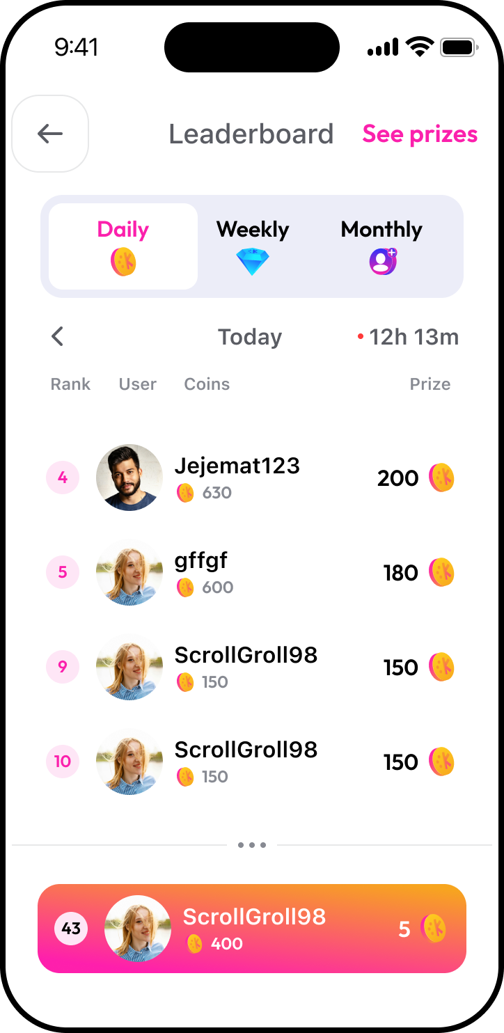
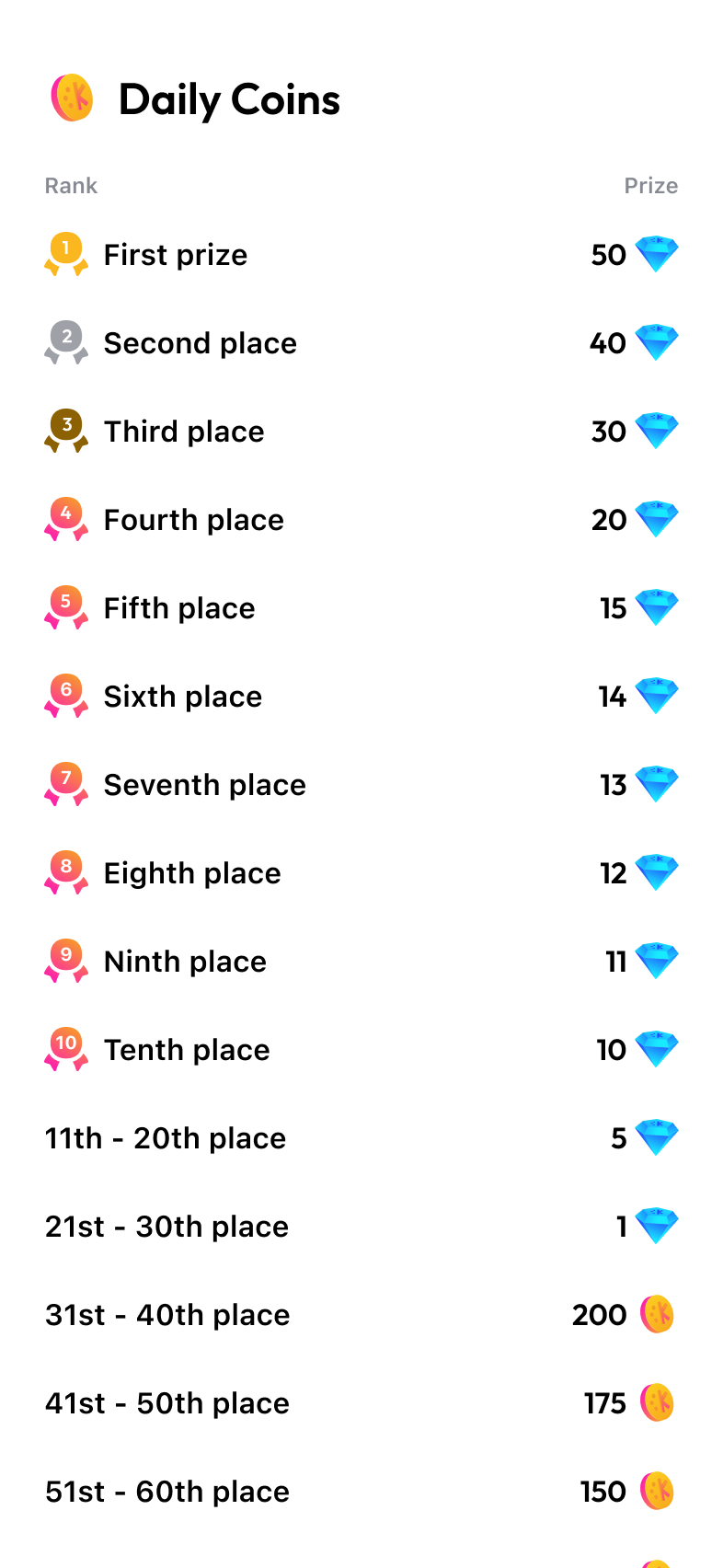
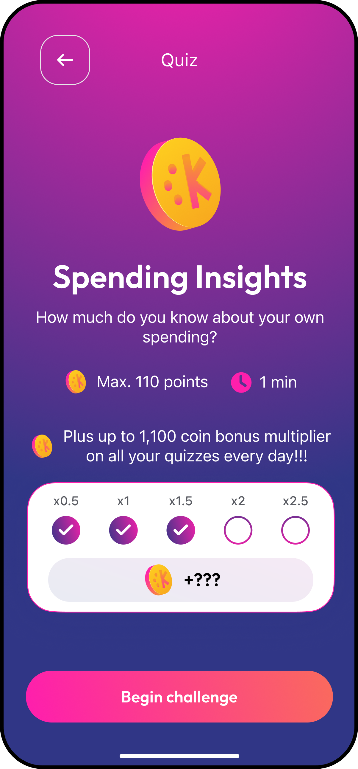
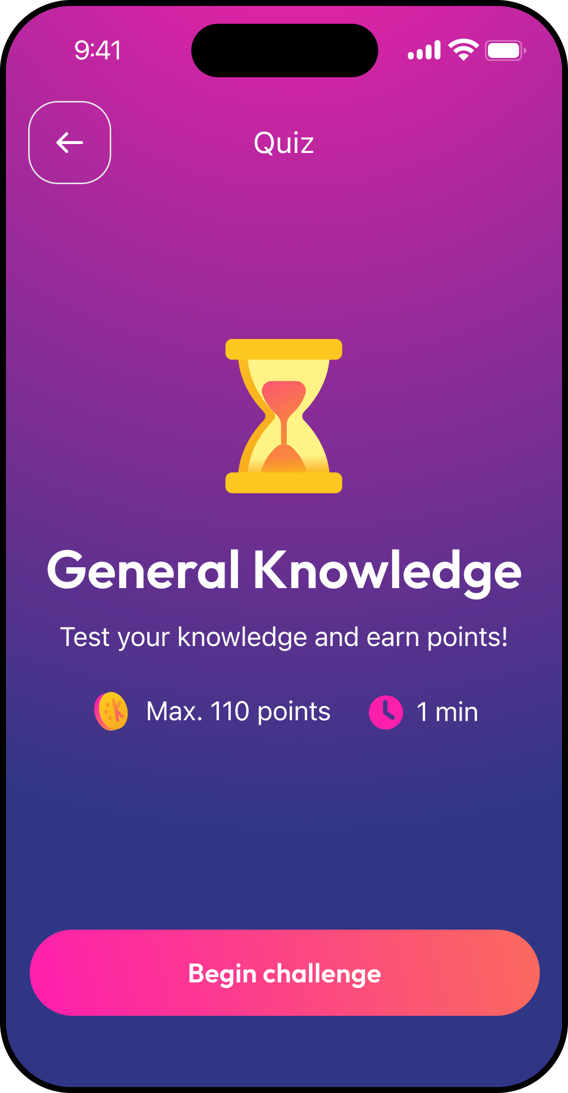
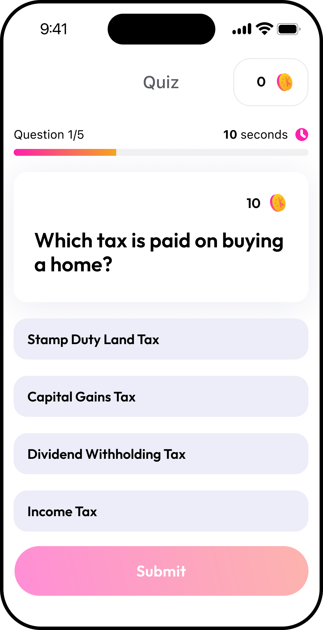
Quizzes, missions, streaks, leaderboards
The daily-habit engine — plus referrals and cashback shopping to give returning users something to earn from.
Component-driven design system
Buttons, modals, quiz and mission cards, leaderboard position, indicators and onboarding footers — light and dark built as parallel sections.
Lifecycle & store surfaces
Around 40 email banners, paid social sets, in-app events for both stores and a full icon set from 36 to 512px.
Three stacked systems, engineered so none can fail alone.
Open banking, insight and rewards are mutually dependent — break one link and the other two die. We sequenced the build so each layer had a reason to exist before the next one landed.
Quizzes, missions, referrals and the house goal all work with zero financial data. Blurred insight modules show the shape of hidden data without faking numbers, and a bonus-diamond banner with live countdown reframes bank linking as an upgrade rather than a toll gate.
The Spendometer scores categories as a share of the user's own spend, not against a national average. Clothing at 3% is "very good" whether that's £30 or £150 — a rule that quietly changed who the product is for.
Re-link, re-consent and re-categorise flows plus a statements review surface let users fix mis-labelled transactions themselves. Trust in the score is treated as a feature with its own UI, not a support ticket.
Coins are soft and abundant; diamonds are hard and redeemable for £10 and £50 transfers. Explicit reward inventory and per-event yield tagging let the economy be generous with dopamine and conservative with real money.
A promotion control table and a slot-based Dynamic Banner mean competitions, prize copy and deeplinks are configured, not released. Growth experiments weekly instead of quarterly.
Faking numbers would have destroyed trust on day one; hiding modules entirely would have made the pre-link app feel like a stub. We blurred the insight modules so users could see the shape of the data waiting for them, and paired it with a time-limited bonus-diamond banner so linking felt like claiming something rather than surrendering something.
Diamonds convert to real bank transfers, so supply had to be deliberately constrained while the app still felt rewarding many times a day. Coins absorb the frequency; diamonds ship with explicit stock (100/100, 20/20) and every earn event is tagged with its exact yield so the economy is auditable.
A flash referral competition is worthless if it takes two weeks to ship. We specified a promotion control table — activate Y/N, start/end datetime, type, prize copy, per-unit yields, deeplink target — feeding a slot-based Dynamic Banner, so campaigns are configuration rather than code.
Two dashboards, one product.
The pre-link dashboard earns the right to ask for bank access; the post-link dashboard pays it back with real numbers. Same modules, same language, radically different information density.
"Person A spends £1,000/month. Person B spends £5,000/month. Clothing at 3% of spend is "very good" for both — but that's £30 for one and £150 for the other."
"Compared to other home buying apps out there… we're the one you'd bring home to meet your parents."
Let's ship
the next one.
Tell us about your project. We'll come back within a business day with a scoped plan and a straight answer.