A prefab catalogue that turns browsing into
bookings
A marketing and lead-gen site for WoodenHousing — four filterable model categories, render-rich design pages, and form, WhatsApp and chat never more than one click away.
Sell a building the way people shop for one?
WoodenHousing designs and supplies modular prefab wooden buildings — homes, resort cottages, cafes and pergolas. The models were ready; the storefront wasn't. Buyers had no way to compare a two-bedroom cottage against a four-bedroom home, and every enquiry depended on someone finding a phone number.
We designed a catalogue-led marketing site around one job: help a self-builder, homestay operator or cafe owner narrow the field in minutes, then hand them three ways to start a conversation. Sixteen screens, delivered in desktop and tablet, on a template system that lets the team add models without redesigning a page.
- Four category listings on one shared, filterable template
- Form, WhatsApp and chat on every path to enquiry
- Desktop and tablet layouts for all 16 screens
- Render galleries with thumbnail rails on every model
Interest existed. A path to enquiry didn't.
Prefab is a considered purchase made on visual confidence — buyers want to see the building, understand its footprint, and talk to a human fast. The old experience broke at all three points.
No way to compare models
Buyers couldn't filter by floors, bedrooms or built-up area, so choosing between a cottage and a home meant scrolling blind.
Four categories, four experiences
Cottage, home, cafe and pergola pages each needed different filters but couldn't afford to look or behave like different sites.
Enquiries leaked away
India's buyers move on WhatsApp. A contact form buried at the footer lost the people most ready to talk.
Renders did the selling, badly
Model imagery existed but had no gallery, no thumbnails and no floor plan access — the strongest sales asset was underused.
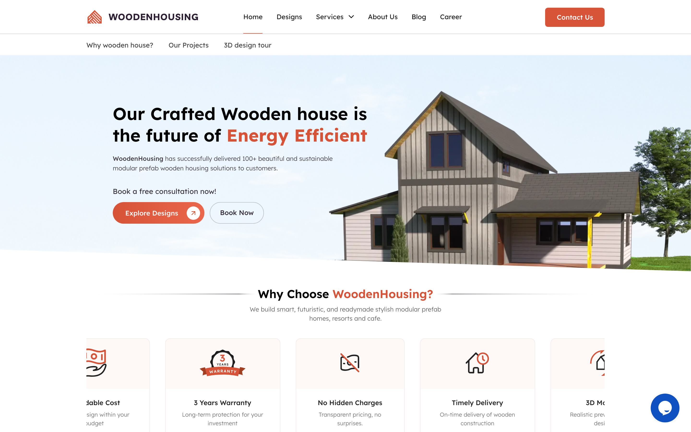
Home with a rotating promise
The headline swaps its closing phrase — Energy Efficient, Better Air Quality — above 'Explore Designs' and 'Book Now', framed by a free consultation invite.
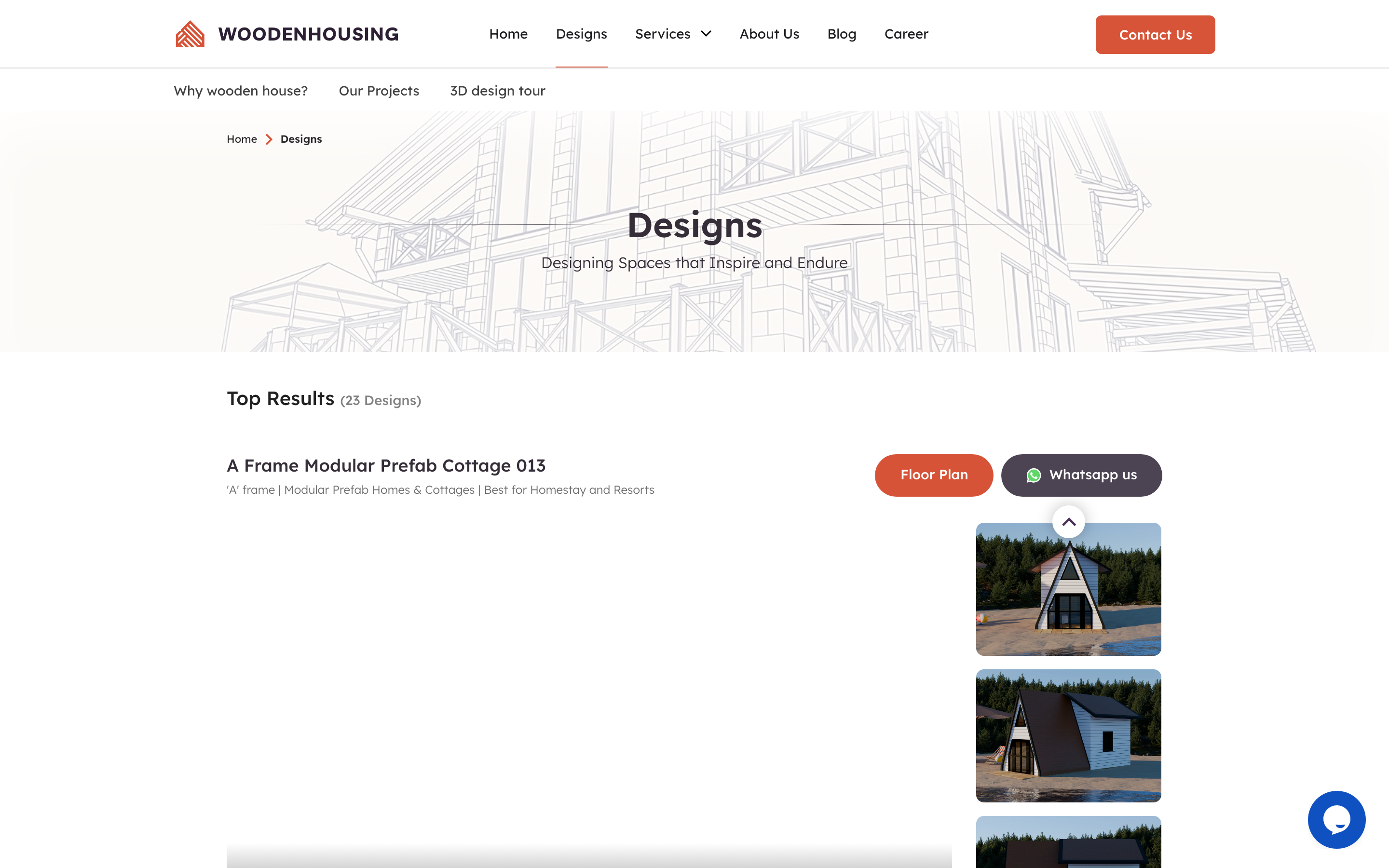
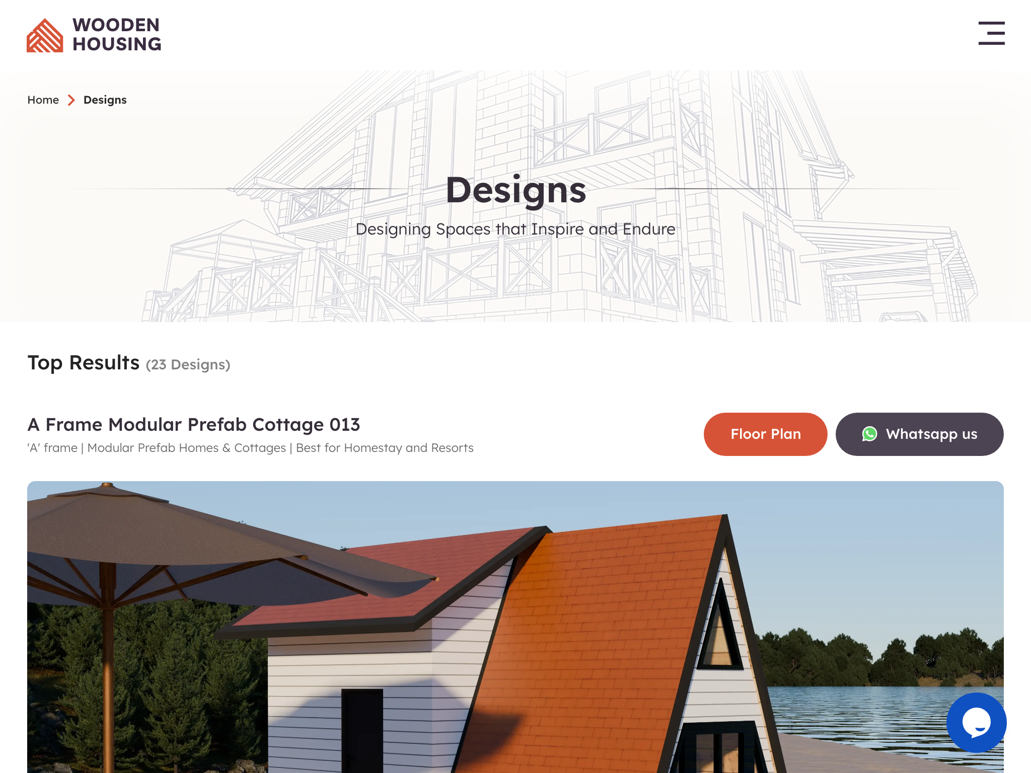
Designs feed with render galleries
A Top Results feed with live design count. Each entry carries taxonomy tags, a thumbnail-rail gallery, plus 'Floor Plan' and 'Whatsapp us' actions.
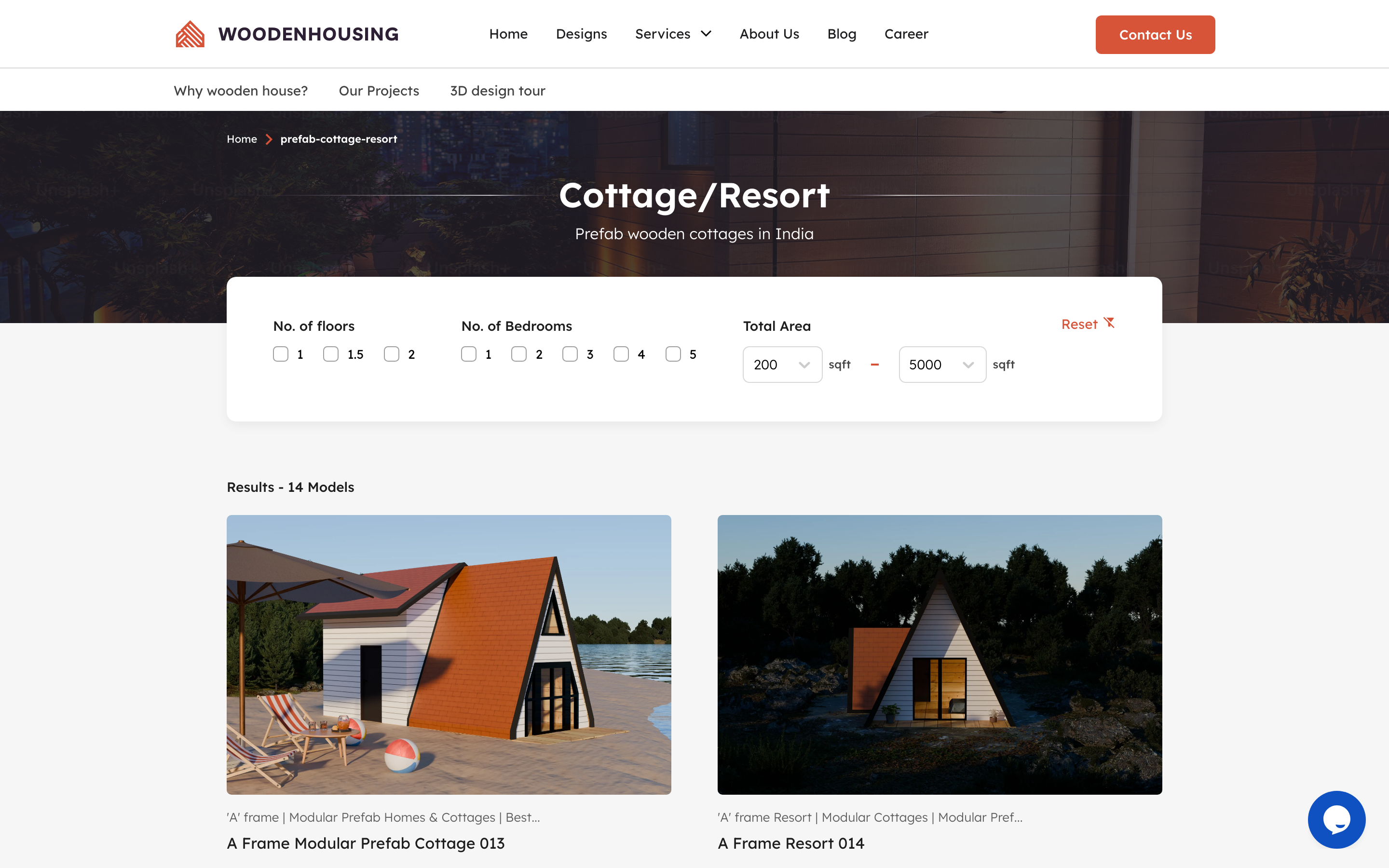
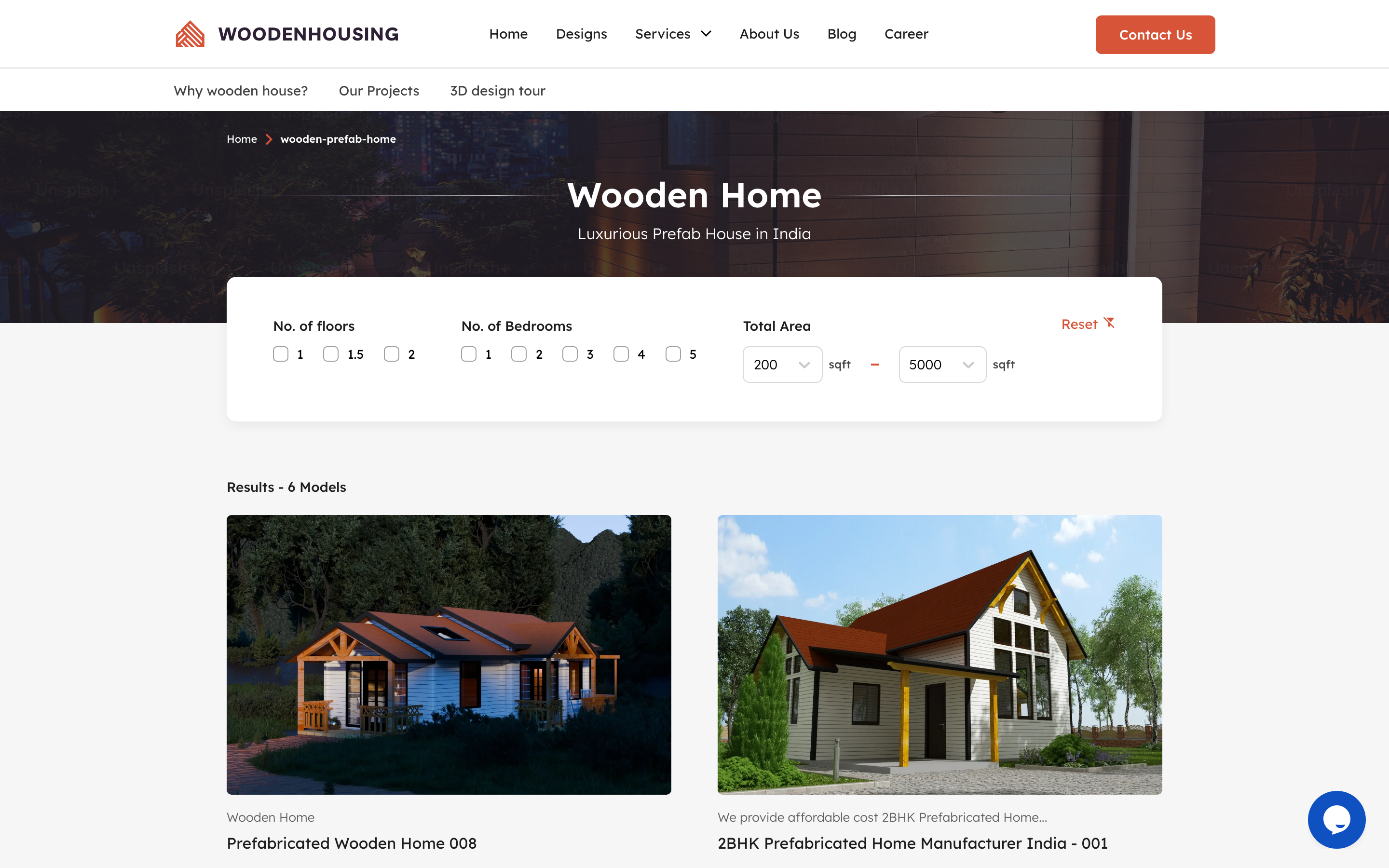
One template, four catalogues
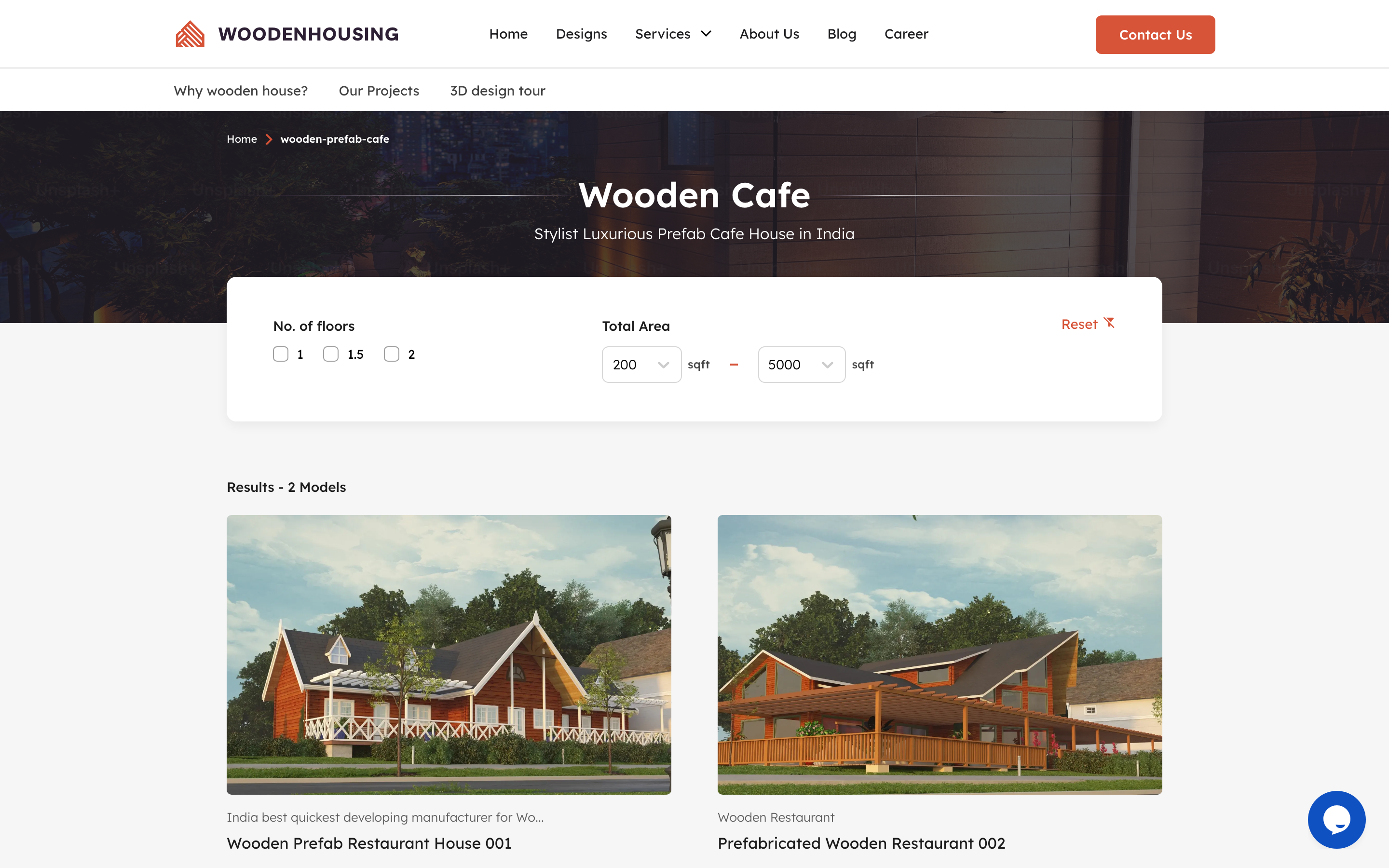
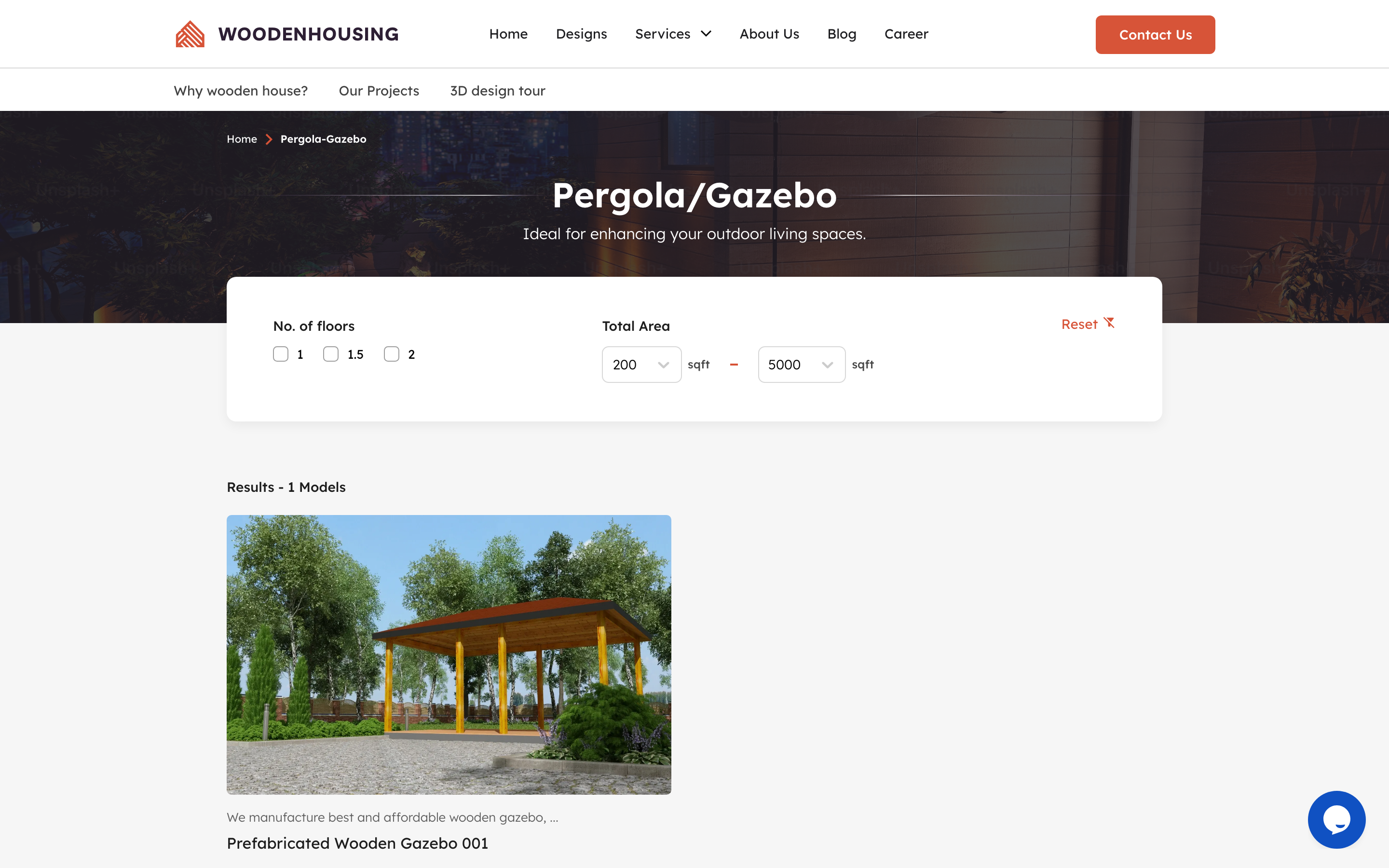
Dark hero with breadcrumb, filter card, result count and model grid — identical structure across Cottage/Resort, Home, Cafe and Pergola.
Why Choose WoodenHousing
An icon-card band handling the five objections that stall prefab buyers: cost, three-year warranty, no hidden charges, delivery timing and 3D modelling.
Blog as slow-funnel proof
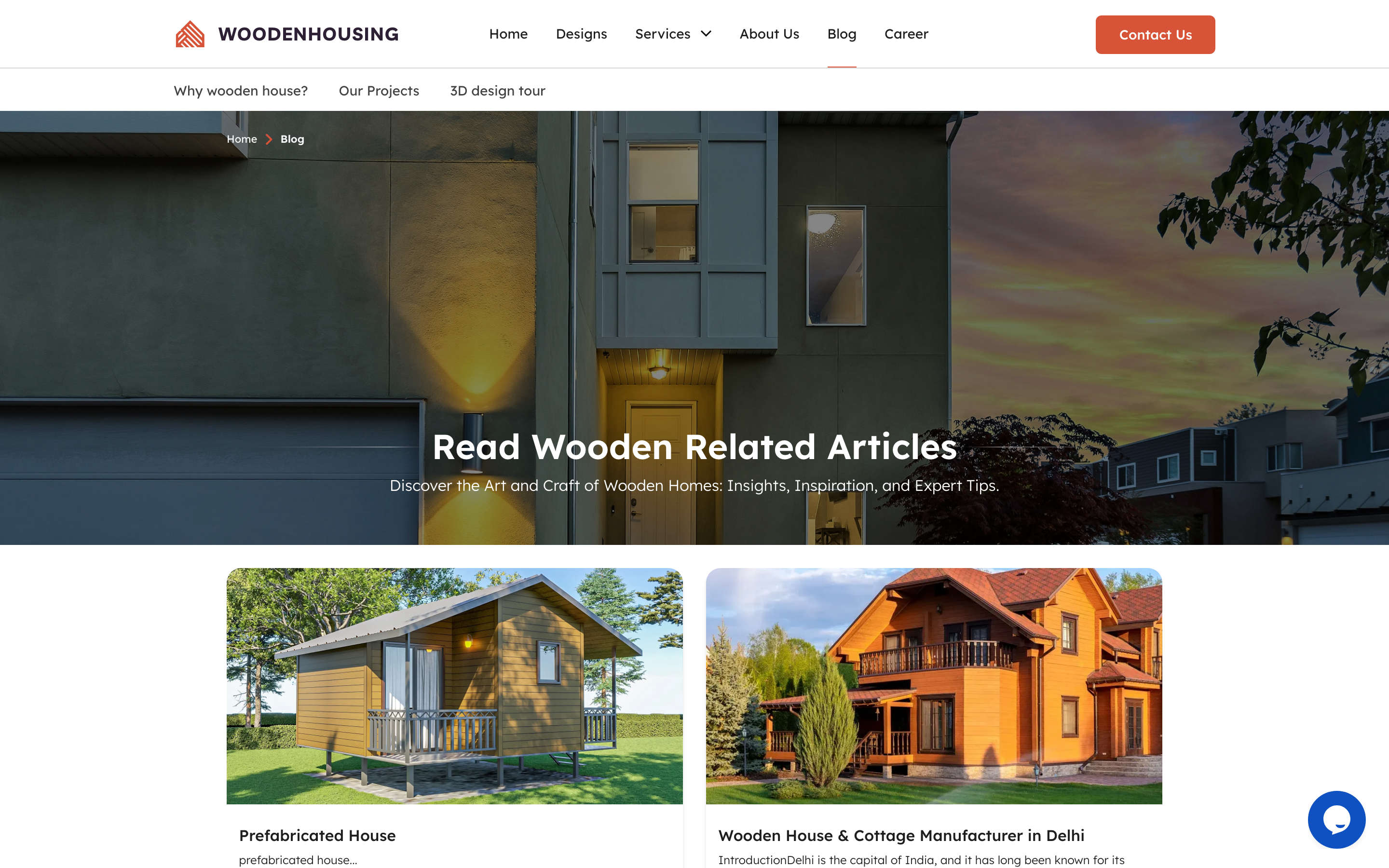
A card grid of articles on prefabricated housing and regional manufacturing, positioned as insights and inspiration for buyers still researching.
Design the template before the pages.
With four categories and two breakpoints, ad-hoc page design would have produced sixteen inconsistent screens. We built rules first.
We modelled how three audiences — self-builders, homestay operators, cafe owners — actually narrow choices: category, then footprint, then look. That order became the site's information architecture.
A single dark-hero-plus-filter-plus-grid pattern serves all four categories. Filters flex by context: bedrooms appear for Cottage and Home, and are dropped entirely for Cafe and Pergola where they mean nothing.
A chat launcher pinned bottom-right on every page, WhatsApp on every model card, and a persistent Contact Us button in the nav. Three routes, no dead ends.
Every screen was designed at both widths in parallel. Tablet collapses navigation into a hamburger and stacks to a single column — same content hierarchy, no feature loss.
Bedrooms matter for a cottage and mean nothing for a pergola. We designed the filter card as a slot system — floors and area are fixed, bedrooms is conditional — so the layout never gaps or reflows awkwardly when a control disappears.
Model galleries carry the sale, but a thumbnail rail that works on a 1440px grid crowds a tablet. We reduced the rail to a swipeable strip and gave the primary render full column width, keeping visual confidence intact.
Form, WhatsApp and chat can easily become three competing interruptions. We assigned each a job: WhatsApp on model cards for hot intent, the nav button for general enquiry, chat pinned bottom-right as the always-on fallback.
Warm, timber-led, and quietly commercial.
Earthy neutrals and generous render space let the buildings do the persuading, while dark category heroes give each catalogue a clear front door.
Let's ship
the next one.
Tell us about your project. We'll come back within a business day with a scoped plan and a straight answer.